Matt Brundage
Thursday, 26 February 2015

Long as she’s got a dime, the music will never stop

The other day, Tanya and I were hanging out in my man-cave, listening to records, as we do most every evening. We had been making our way through my otherwise-neglected collection of 45s when I rediscovered a single that I had completely forgotten about, David Wills’ “There’s a Song on the Jukebox.”

Now I hope I don’t have to describe to you what a perfect gem of an old country song this is. As I hit “play” again after the needle returned, the song got me thinking about jukeboxes, but more specifically, the pricing and economics behind them.

From the 1950s, and lasting until even the 1980s, the jukebox was an essential cog in the music industry machine. In rock and roll’s formative years, the price of a single play on a typical jukebox was ten cents, as evidenced by Chuck Berry’s 1956 hit, “Roll Over, Beethoven:” Long as she’s got a dime, the music will never stop. Fast-forward about twenty years and our old buddy David Wills is still feeding single dimes into the jukebox. As inflation had eroded the value of a dime by almost half in the intervening 20 years, a single play on a jukebox in 1975 represented a much better value than it did in Chuck Berry’s era.

But let’s take it a step further and compare a single play in 1956 to an equivalent purchase in the present day. Merely adjusting for inflation won’t cut it, as there has been a marked increase in disposable income per capita in the United States, after adjusting for inflation. Based on the graph (below), it’s safe to say that per capita real disposable income has increased three-fold since the mid-fifties.

Real disposable personal income per capita.


Our inflation-adjusted 1956 dime is worth about $.87 today. But that dime was even more valuable back then, as it represented a much bigger piece of the disposable income pie. Adjusting that inflation-adjusted dime for constant real disposable income yields a value of $2.61. Yep.

Would you pay $2.61 today to listen to a two-minute pop song once? Remember that in the 1950s and 1960s, a typical pop song lasted about two minutes. Three minutes tops.

Put another way, would you spend around $60 to listen to an hour of music — music that you wouldn’t even own afterwards? No, you wouldn’t. But you’d likely pay that amount on an annual basis with a music subscription service such as Pandora, Spotify, Rdio, Google Play, etc. Astounding: the same dollar figure that once provided only an hour’s worth of listening pleasure now provides a whole year’s worth — and with a virtual jukebox with tens of thousands of songs.

Over the past 60 years, the cost of renting music has decreased by 99.9886% on a per-hour basis.

Wednesday, 11 February 2015

Mobile strategy: two opposing philosophies

I wrote this piece last summer, as part of a lively discussion I was having with colleagues regarding the future mobile strategy for FAA.gov. While some of my research and positions are pertinent only to FAA, I have found that most of it can be generalizable to the wider web development community.


We have to be careful when we talk about designing for context vs. having a device-agnostic approach. These two philosophies are opposing. Allow me to explain.

Smartphone usage trends

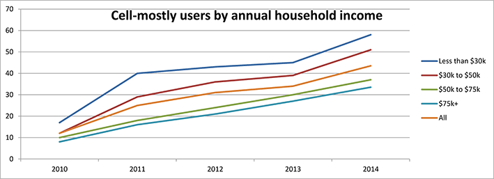
As of spring 2013, well over half of all American adults are cell phone internet users. Among those cell internet users, 34% use their phone as their primary or exclusive means of going online. This is an increase from 31% in 2012, and from 25% in 2011. In other words, the proportion of those who use their cell phones exclusively to access the internet is trending upward and has been a significant percentage for several years.

Cell-mostly internet users by household income.
Full report: Percentage of cell phone internet users who use their phones exclusively or mostly to go online

Three market trends indicate the rise of small-screen (“mobile”) browsing as a normal, mainstream means of accessing the internet:

  1. cell phone (smartphone) adoption percentage
  2. cell phone internet use percentage, and
  3. cell phone primary or exclusive internet use percentage.

All three of these percentages are steadily trending upward year-over-year.

What does all of this mean?

For a growing proportion of the population, there is no such thing as “device context” or “task context.” (two sides of the same coin) Many people aren’t doing different tasks on different devices because they use only one device primarily or exclusively. And regardless of how many devices users have, they expect content to be available and usable to them on the device that they are currently on.

What some call their “Mobile Strategy” should simply be called their “Strategy.” It should focus on getting all of their content accessible and usable on as many screen resolutions as possible. If a particular piece of content is relevant on a desktop or laptop, then it’s relevant on a “mobile” device. This approach — this device-agnostic philosophy — is echoed throughout the president’s Digital Government Strategy, published in 2012. (Press release) (Device-agnostic means that a service is developed to work regardless of the user’s device, e.g. a website that works whether viewed on a desktop computer, laptop, smartphone, media tablet or e-reader.)

“Americans deserve a government that works for them anytime, anywhere, and on any device.”

President Barack Obama

FAA.gov, mobile screenshotWhile developing FAA.gov, I laid the foundation of our device-agnostic approach. With responsive design (CSS rules), I endeavored to make FAA’s pages look at the very least acceptable and readable at any screen resolution. But our work is in no way finished. We can further optimize (both template-level and page-specific) to ensure that pages look and behave their best at smaller resolutions.

Recommendation

If you haven’t already guessed, my recommendation remains that we continue to employ responsive design (CSS rules) on FAA.gov — to build on the foundation that I have already laid — to optimize all of our content for whatever device a visitor will choose to use.

Our other two options involve creating and maintaining two websites. Both of these options involve making assumptions about our users, based solely on their device type or screen resolution.

Assumptions

  • The assumption that there is a clear distinction between “desktop tasks” and “mobile” tasks. This distinction was relevant in the early days of mobile internet — when responsive design had yet to mature and when smartphones were not as capable as they are now. But user expectations and usage patterns have changed and continue to change, as outlined in the section above. People expect websites to work on their device, and FAA must deliver on those expectations.
  • The assumption that we can divine what content our visitors will want to see on their mobile device vs. what content those visitors won’t want to see, or won’t need to see. Content curation is based on this faulty assumption. The whole concept of content curation ignores the reality that smartphone and tablet users are already exploring faa.gov in ever-increasing numbers — to the tune of 24% of all visits, and over 35% on weekends! (July 2014) I can assure you that these ½ to ⅓ of our site visitors are not hopelessly lost and desperately looking for our pared-down, insultingly simplified mobile site.
  • The assumption that a mobile user fits a single, outdated set of characteristics. Can FAA determine the user’s mindset, their “on-the-go” attitude, their location relative to an available desktop or laptop computer, their motivation or intent to consume content, or their information needs based solely on the device that they’re using?

Other problems with a two-site approach

  • Forcing the user to redirect to a separate mobile site flies in the face of the user experience credo that “the user is always in control.” Period. Redirecting the user when that corresponding page does not exist on the mobile site is the worst possible course of action to take, as the content would be inaccessible on that device.
  • The definition of “mobile” is changing, and there is less of a distinction. For instance, is a Dell Venue 11 Pro considered a mobile device, since it is sold as a tablet? Or is it really a laptop, since it comes with an optional keyboard and has the same screen size as an 11″ Apple MacBook Pro? Or is the 11″ MacBook Pro now considered a mobile device? For that matter, is any laptop considered a mobile device when it is used on a plane, train, or automobile?
  • A two-site approach will increase maintenance — perhaps not by a factor of two, but by a significant amount. Maintaining two “separate but equal” websites will introduce programming inconsistencies — when one feature is correct on one site, but incorrect or different on the other. And certain features may be intentionally different across the two sites, but that fact may not be entirely obvious. Over time, it will become exceedingly difficult to determine the “correctness” or current relevance of a given block of code.

In summary

I recommend that we continue to maintain a device-agnostic approach to web development, and to further optimize our content for smaller screens (“mobile”, if you will). Refining and simplifying our content can have a dramatic, positive effect on the user experience — but not just on mobile devices but on the desktop as well.

Works cited and consulted

Friday, 28 February 2014

FAAcelift

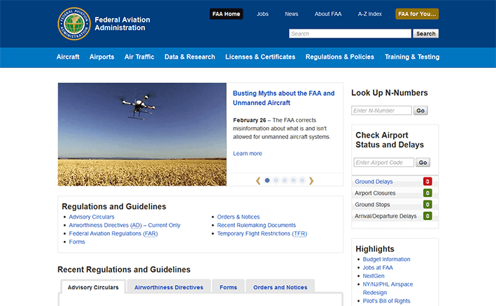
screenshot of www.faa.gov

I unveiled a new site earlier this week for the Federal Aviation Administration. That is, it feels like an entirely new site because the changes are so sweeping and comprehensive. I’ve been referring to the project as a FAAcelift (get it?), but the scope of the project is much more than just a fresh coat of CSS.

A huge thanks to my coworkers and the FAA Office of Communications for their support and encouragement, and for entrusting me with this opportunity. Improving FAA’s public-facing website was pure bliss, and I’m fortunate that I was given the time — and autonomy — to commit the following changes to the template. When I wake up in the morning, I am always excited about getting to work. In a way, I feel privileged. The constant feeling of fulfillment never goes away.

Notable changes/improvements

Design/layout

  • Responsive layout is informed by design breakpoints — not necessarily by device breakpoints. In other words, the responsive layout aspires to be device-agnostic.
  • The appearance of pre-content page messages has been standardized. A “debugging” page message appears when the development tier is in debug mode. The News CMS mini-toolbar is styled in the same manner. Pre-content page messages are dismissible.
  • FAA and DOT seals are approximately 25% larger than before. The words on the seals are closer to being legible.
  • Text is, on average, 15% larger than before and is closer to browser default font sizes.
  • The page tools box appears to reside in the right sidebar (to the right of the page title), but it remains visible even if the right sidebar is hidden.
  • Text in ordered and unordered list items start at the same horizontal place on a given line. Intra-page anchor links (e.g. class="anchorDown") are similarly aligned.
  • Vertical navigation supports additional levels of indentation. Example of prolific nesting
  • Blank space between paragraphs and lists has increased to be equal to the default line height of its corresponding text. This affords consistent vertical flows of text.
  • Message boxes look 43% less ugly. Also, they’re dismissible. Message box icons are from a single set: Chalkwork. Icon size has increased proportionally to the text size increase.
  • Footer: Readers and Viewers icons better match current software branding used by Adobe and Microsoft. Icon size has increased proportionally to the text size increase.
  • ForeSee modal dialog styles are closer to template styles. ForeSee’s FAA seal image, in particular, is more accurate.
  • CSS filter effects progressive enhancement: desaturation of the page content when it loses “visual focus” to certain page elements with higher z-indexes:
    • Colorbox modal dialog
    • ForeSee modal dialog
    • jQuery UI modal dialog
  • A larger percentage of CSS rules use relative (em) unit values instead of absolute (px) unit values. With relative unit values, page element properties such as margin, padding, and width will scale relative to the user’s default font size (set in the browser) or font scale factor (set in the operating system).
  • Font sizes (as calculated by the browser in pixels) are whole numbers when possible in an attempt to overcome differences (subtle and not-so-subtle) in font rendering and rounding among various browsers. See:

screenshot of Air Traffic page

JavaScript

  • A class of “noJS” or “js” is applied to the <html> tag. The correct class is determined (via JavaScript) before any CSS is loaded, avoiding potential rendering engine repaints/reflows, and thus, an appearance of latency.
  • Upgraded to the latest stable releases of jQuery, jQuery Migrate, and jQuery UI.
  • Upgraded template-level plugins Colorbox, bxSlider, and a forked version of beautyTips which I then had to fork again.
  • When feasible, the site loads non-minified versions of JavaScript libraries and plugins on the development tier and minified versions of the same on the production tier. This makes it easier to debug JavaScript errors/warnings on the development tier.

Markup

  • DTD changed to HTML5.
  • Template markup is valid according to the HTML5 DTD.
  • Removed <meta> “keywords” from template output.

Browser support

  • IE6 support has been dropped, as its marketshare has fallen below one-tenth of 1%. No testing occurs in this browser. For what it’s worth, IE6 loads the lone CSS “fixes” file, intended mostly for IE8.
  • IE7 support has been dropped, as its marketshare has fallen below 2/3 of 1%. Cursory testing may still occur in this browser, although there is no guarantee that the template structure will hold up reasonably well. For what it’s worth, IE7 loads the lone CSS “fixes” file, intended mostly for IE8.
  • JS-/canvas-based rounded corners has been dropped. It was previously implemented in IE7 and IE8.

User experience/accessibility

See section below for how I aspire to meet Web Content Accessibility Guidelines: WCAG 2.0

  • “Skip to page content” link becomes visible on keyboard-activated focus.
  • Keyboard-accessible (focusable) dropdown menus (horizontal navigation and “FAA for You”)
  • Contrast between backgrounds and text complies with WCAG 2.0, Level AAA. (see section, below)
  • Page Last Modified date above the footer is in the long-date format to resolve ambiguities surrounding the two-digit representations of the day, month and year, and the ordering of said numerals. If a short-date format is recommended for aesthetics, it should conform to ISO 8601.
  • Page Last Modified time has been converted from the 24-hour clock (military time) to the 12-hour clock (AM/PM) for the sake of plain language and understandability. Additionally, the time zone indicator reports standard or daylight saving time as appropriate.
  • All heading levels (<h2>, <h3>, etc.) are properly differentiated by font size, line height, and margins. They are closer to browser defaults.
  • WAI-ARIA Landmark attributes adorn key sections.
  • jQuery UI Tabs follow WAI-ARIA best practices.
  • On hashchange events (such as “Skip to page content” or other intra-page anchor links), browser focus state now reliably mirrors visual focus across all browsers.
  • Breadcrumb delimiter is no longer a right-pointing double-angle quotation mark, but a solid arrow. The arrow glyph is wrapped with aria-hidden=”true” to prevent screen readers from reading this design element.
  • The legacy mode message (displayed in the pre-content area on the development tier) now reports all conditions that put the page into legacy mode. The messages are less cryptic and more developer-friendly.
  • If the jQuery UI autocomplete widget in the site search field is left open and no item is selected, hovering over neighboring drop-down menus (“FAA For You…” or the horizontal nav) closes the autocomplete widget. This is done for the sake of minimizing z-index collisions.
  • Sticky horizontal navigation.

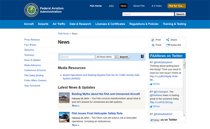
screenshot of News page

Web Content Accessibility Guidelines: WCAG 2.0

FAAcelift aspires to meet WCAG 2.0 (Level AAA), particularly in the visual presentation of text.

  • 1.4.1: Use of color: The template is now fully compliant. In the previous version of the template, the visited link color was the same as the hovered link color. Hovering over visited links resulted in no visual change. This has been remedied in the latest template revision. Additionally, developers are encouraged to not use color as the only visual means of conveying information.
  • 1.4.2: Audio control: Not applicable to the template. No known site sections or pages play audio on page load.
  • 1.4.3: Contrast ratios (minimum): The template meets and exceeds this requirement. See full explanation in section 1.4.6 (below).
  • 1.4.4: Resize text: Compliant in all page layout scenarios. See also 1.4.8.
  • 1.4.5: Images of text: The template is compliant. See also section 1.4.9 (below).
  • 1.4.6: Contrast ratios (enhanced): (Level AAA) “The visual presentation of text and images of text has a contrast ratio of at least 7:1” with limited exceptions.

    Already compliant

    • Page title
    • Body copy
    • Horizontal navigation
    • Vertical navigation
    • New design of footer (first row with blue background)

    Made compliant

    • Page subtitle: increased from 3.9:1 to 9.7:1
    • Breadcrumb links: increased from 2.6:1 to 7.1:1 (not hovered) and 10.6:1 (hovered)
    • Links (visited and unvisited): increased from 6.2:1 to 7.1:1
    • Hovered links (visited and unvisited): increased from 3.2:1 to 10.6:1
    • Input and textarea placeholder text: increased from 4.6:1 to 7.1. The color was deferring to the browser’s default placeholder color. In Firefox 25, for example, the default placeholder color passes WCAG AA but fails WCAG AAA.

    Improved, but not compliant

    • “FAA for You…” dropdown in the header: increased from 3.1:1 to 4.5:1. This complies with Level AA, but not Level AAA.
  • 1.4.7: Low or No Background Audio: (Level AAA) Not applicable to the template.
  • 1.4.8: Visual Presentation: (Level AAA)
    • First requirement: Not compliant. We do not provide a mechanism for the user to change the background or foreground colors.
    • Second requirement: Made compliant. In the default page layout (with both sidebars present), the average number of characters per line has been reduced from about 95 in template v. 3 to about 80 in template v. 4. The upper limit recommended by WCAG 2.0 is 80 characters.
    • Third requirement: Partially compliant. Pro: we do not provide a CSS rule in the template to justify paragraph text. Con: we do not provide a mechanism in the template to un-justify text affected by custom CSS.
    • Fourth requirement: Partially compliant. Text line height has increased slightly from 145% of text size to 150% to meet this requirement. Spacing between paragraphs has increased from 85% of line height to 100% of line height, but this spacing is not large enough to meet this requirement.
    • Fifth requirement: Compliant in most scenarios when the template is in the default page layout (with both sidebars present). Newer browsers that support media queries are fully compliant, as the responsive layout ensures that the user will never have to scroll horizontally to read overflowing text.

    Key advisory techniques for 1.4.8:

    • Providing large fonts by default. “Large” is a relative term, but the base font size of the page (while still less than the browser default) is about 15% larger than before.
    • Avoiding chunks of italic text. The default style for <blockquote< displays text in the normal font style instead of in italics (or oblique).
    • Making links visually distinct. Breadcrumb links conform to the same link color scheme as the other links in the main content area.
  • 1.4.9: Images of text (No exception): The template is fully compliant, but individual pages may not be fully compliant. Our “Visit FAA Mobile” ad in the footer violated this rule, but the image has been reworked as text styled with CSS. Right sidebar ads and homepage ads frequently violate this requirement. Merely providing alt text on images ensures Section 508 compliance but does not necessarily ensure compliance with this requirement.

screenshot of Michael Huerta biography page

Sunday, 27 October 2013

Antisocial media

Tanya, being a babyBefore Tanya was born, Annie and I agreed that we wouldn’t be the kind of new parents who posted on social media every time their newborn did something cute or, say, had a particularly interesting bowel event.

While we’ve had no trouble keeping that informal agreement, our enthusiasm for Tanya (and burgeoning media collection) needed a proper outlet. To that end, this site now hosts more baby photos than you’ll know what to do with. And in June, I had the pleasure of coding a videos section, which — for now at least — is exclusively Tanya-centric.

I will admit that no one gets more enjoyment out of all this media than Annie and me. The videos section was developed mostly so that Annie could have an accessible way of viewing our growing collection. Otherwise, the files would have just languished somewhere on a hard drive, deep in hard-to-reach directory trees.

And putting all of this up on Facebook didn’t seem right, somehow — as if I wouldn’t fully own it anymore. Facebook (or whatever site) can change their privacy policies or terms of service whenever they feel like it, and we’re all seemingly at their mercy. That’s not for me. Especially not for something this important.

Thursday, 7 March 2013

Tanya Alexa Brundage

Tanya Alexa Brundage I am in love.

Tanya greeted the world on March 5, 2013 at 8:17pm. She clocked in at 9 pounds, 11.3 ounces (or 0.004403 metric tons!) and a length of 20.5 inches.

Tanya comes home with us on Friday to begin her life as a full-time baby.

Wednesday, 24 October 2012

Big-ass salad

The salad, in all its glory. This evening, I took Leo Babauta’s advice and made myself a big-ass salad. I used the biggest serving bowl that Annie could find. You can’t really get the scale from the photos, but the pile of vegetables is about the size of a regulation-size basketball. It was a manly pile of salad and took me close to half an hour of non-stop eating to polish this thing off.

Ingredients

Red-leaf lettuce, spinach, kale, Chinese broccoli, raw mushrooms, mushrooms An alternate view of the salad. marinated in red wine vinegar and minced garlic, a carrot, an orange bell pepper, a roma tomato, a handful of cherry tomatoes, sun-dried tomatoes marinated in olive oil and Italian spices, non-marinated sun-dried tomatoes, green olive tapenade, pistachio nutmeats, shredded Parmigiano-Reggiano cheese, and toasted corn kernels. Tomato juice to wash it down.

Sunday, 19 August 2012

Weighty disconnect

At my heaviest in March 2008, I was 208 lbs, with a BMI of 27.4. By the criteria set forth by the CDC, I was considered overweight. And yet, during that heavy time in my life, no one commented on my weight or urged me to lose weight.

Strangely, the only critical comments I’ve received happened after I dropped a significant amount of weight and got back down to my ideal weight of 160 to 165 lbs. For the record, 165 lbs on a 6″ 1′ frame equals a BMI of 21.7, which comfortably falls within the normal range, according to the CDC. Furthermore, a study in the New England Journal of Medicine asserts that, by lowering my BMI, I had decreased my relative risk of death. At a certain level, this is just common sense, but it’s nice to see it proven with data.

My BMI, 2008 and 2012

Even considering my current BMI (21.7), I actually still have room for improvement! According to the same NEJM study, I could theoretically drop another 20 pounds and further decrease my risk. But oh, the comments I would get.

The irony of all this is that as I was decreasing my relative risk of death in 2009 and 2010, people began to get concerned for my health! Yet, during my twenties, no one said a word as I slowly packed on the pounds, became overweight, and was statistically likely to have a lower life expectancy.

Sunday, 29 April 2012

Accelerate

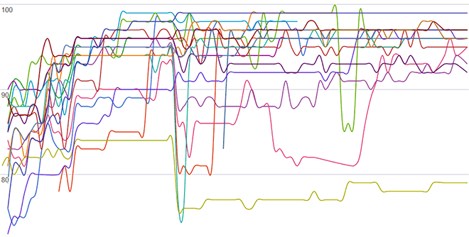
My dearly beloved website clients: over time, your sites are loading faster and faster1 — and there’s nothing you can do about it. Just another fringe benefit of having me as your web developer.

Homepage speeds (all data points), Oct 2010 to Apr 2012

Google page speeds

Homepage speeds (averaged), Oct 2010 to Apr 2012

Google page speeds

Coincidentally, our happy little graph here appears to evoke a logarithmic trend.


1: As measured with Google’s Page Speed extension for Firefox, which rates a page’s loading speed based on these criteria.

Sunday, 12 February 2012

Coding on the shoulders of giants

Isaac Newton I write and edit code for a living. Because I enjoy what I do, I have this insatiable thirst for knowledge and self-improvement: “How can I write this function in fewer lines?” “How can I make this CSS bullet-proof?” “How can I make this page load faster?” Not for a second do I purport that I come up with solutions solely on my own. I have this small army of disparate web developers at my disposal — a collection of developers that, for all intents and purposes, functions as an extension of my own brain.

Kroc Camen

Where do I begin? Kroc was one of the first to fully embrace the still-emerging HTML5 specification, his Video for Everybody! just works, and his approach to writing CSS and .htaccess is refreshing and enlightening.

Dean Edwards

After Microsoft released IE6 in 2001, the company essentially stopped all browser development for five years. However, during that time, a man in the UK was busy writing a script that, when run in IE6, corrected many of the rendering bugs inherent in that browser and even added support for certain CSS rules that IE7 would eventually support. If you’re curious or pedantic enough to parse through Dean’s code, you will soon realize that he is insane.

Joe Hewitt and other Firebug contributors

When I write code, I usually have the Firebug pane open constantly. I wouldn’t be as efficient or effective at what I do without Firebug. Proper respects to Joe Hewitt and other contributors to Firebug: some anonymous, some not well known.

Paul Irish

I just know it: news will soon surface that the man known as Paul Irish is actually several Google employees working collaboratively under the same alias. The man seems to have his paws in everything. Deep breath: HTML5 Boilerplate. Move the Web Forward. Modernizr. CSS3 Please. HTML5 Please. W3Fools. HTML5 Readiness. Front-end Code Standards & Best Practices.

And it doesn’t hurt that he’s deeply knowledgeable, funny, and — might I add — handsome.

Steven Levithan

In the short 15 months that I worked alongside Steve, I learned more about web development best practices, regular expressions, and JavaScript than I had in all years prior. Many of my Oh My God, it’s full of stars! moments are because of Steve.

Jens Meiert

Jens is the expert and I enjoy reading his posts about code maintenance. He’s also a bit of a Renaissance man. I get deeply jealous if I think about it too much.

Eric Meyer

Eric, for a while, was the go-to guy for all things CSS. He wrote CSS: the Definitive Guide, for Pete’s sake! Eric is a dog who has had his day, but he can still churn out thought-provoking posts.

Ben Nadel

It seems that whenever I have a ColdFusion problem that I need to solve, my search ends when a Ben Nadel blogpost succinctly tells me exactly what I need to know. That’s not at all an oversimplification.

Chris Pederick

Chris, British-born but now residing in California, is the author of the invaluable Firefox extension Web Developer. Every time the extension has a major update, I send Chris a thank you gift from his Amazon wishlist. Along with Firebug, Web Developer is indispensable to developers — I couldn’t imagine the browser without it.

John Resig

The creator of jQuery, Resig made JavaScript interesting again and is arguably the man most responsible for its resurgence.

Steven Souders

Steve, an former employee of Yahoo (now with Google), is the one who got me interested in web page speed optimization. However, in a strange twist of fate, I never installed his YSlow browser plugin, but instead opted for a similar plugin, Google PageSpeed. But still, Souders wrote the book on front-end page performance.

Wednesday, 26 October 2011

Deer population control: the final solution?

Recently, Annie went walking in Sligo Creek Park and saw a sign announcing the ongoing deer population management initiative, which involves mass killing. The Montgomery County Dept. of Parks will be reviewing public comments through November 10th, and Annie felt compelled to respond.

The letter below is her response to the Montgomery County Dept. of Parks.

cute little deer While my husband and I understand people’s concern regarding the current deer population, we strongly oppose your plans for a mass killing of deer when there’s a more humane alternative available. We’ve found information about a protein contraception vaccine that has been effectively used in Gaithersburg and other areas[1]. We’ve also found information that supports the effectiveness and safety of this method and it shows a 60% reduction in the deer population[1][2]. The cost of this method is lower than what is shown on the reports cited on your website.[3]

From NIST: “Two-shot PZP vaccination programs, sponsored by the HSUS, have been more than 90 percent successful at blocking pregnancies for one year in white-tailed deer and wild horses in other areas of the country. In addition to its proven effectiveness, the PZP vaccine can be delivered easily by darts, cannot pass into the food chain, does not affect normal mating behavior, shows no side effects and allows a return to fertility when no longer administered.”[1]

Even if the contraceptive method has to be done annually, the deer population and the need for contraceptive vaccines will decline[2]. This is a better solution than the annual killing of these deer.

If deer have no natural predators, are we to reduce ourselves to the levels of animals and simply kill? What makes us different is that we have the ability to feel compassion. I’ve been in a car accident involving a deer; deer have eaten plants from my garden. However, I don’t see this as justification for a mass killing of these animals. Deer can’t come to public meetings, send emails, or protest for their right to live. It’s our responsibility to protect those who don’t have a voice and are being inhumanely treated.

Works cited

[1] Deer Immunocontraception at NIST
[2] Deer Contraception Works!
[3] Immunocontraception (Deer Birth Control)