Mobile strategy: two opposing philosophies
I wrote this piece last summer, as part of a lively discussion I was having with colleagues regarding the future mobile strategy for FAA.gov. While some of my research and positions are pertinent only to FAA, I have found that most of it can be generalizable to the wider web development community.
We have to be careful when we talk about designing for context vs. having a device-agnostic approach. These two philosophies are opposing. Allow me to explain.
Smartphone usage trends
As of spring 2013, well over half of all American adults are cell phone internet users. Among those cell internet users, 34% use their phone as their primary or exclusive means of going online. This is an increase from 31% in 2012, and from 25% in 2011. In other words, the proportion of those who use their cell phones exclusively to access the internet is trending upward and has been a significant percentage for several years.
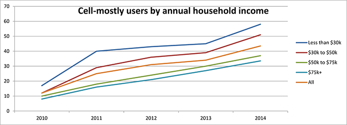
Full report: Percentage of cell phone internet users who use their phones exclusively or mostly to go online
Three market trends indicate the rise of small-screen (“mobile”) browsing as a normal, mainstream means of accessing the internet:
- cell phone (smartphone) adoption percentage
- cell phone internet use percentage, and
- cell phone primary or exclusive internet use percentage.
All three of these percentages are steadily trending upward year-over-year.
What does all of this mean?
For a growing proportion of the population, there is no such thing as “device context” or “task context.” (two sides of the same coin) Many people aren’t doing different tasks on different devices because they use only one device primarily or exclusively. And regardless of how many devices users have, they expect content to be available and usable to them on the device that they are currently on.
What some call their “Mobile Strategy” should simply be called their “Strategy.” It should focus on getting all of their content accessible and usable on as many screen resolutions as possible. If a particular piece of content is relevant on a desktop or laptop, then it’s relevant on a “mobile” device. This approach — this device-agnostic philosophy — is echoed throughout the president’s Digital Government Strategy, published in 2012. (Press release) (Device-agnostic means that a service is developed to work regardless of the user’s device, e.g. a website that works whether viewed on a desktop computer, laptop, smartphone, media tablet or e-reader.)
“Americans deserve a government that works for them anytime, anywhere, and on any device.”
President Barack Obama
 While developing FAA.gov, I laid the foundation of our device-agnostic approach. With responsive design (CSS rules), I endeavored to make FAA’s pages look at the very least acceptable and readable at any screen resolution. But our work is in no way finished. We can further optimize (both template-level and page-specific) to ensure that pages look and behave their best at smaller resolutions.
Recommendation
If you haven’t already guessed, my recommendation remains that we continue to employ responsive design (CSS rules) on FAA.gov — to build on the foundation that I have already laid — to optimize all of our content for whatever device a visitor will choose to use.
Our other two options involve creating and maintaining two websites. Both of these options involve making assumptions about our users, based solely on their device type or screen resolution.
Assumptions
- The assumption that there is a clear distinction between “desktop tasks” and “mobile” tasks. This distinction was relevant in the early days of mobile internet — when responsive design had yet to mature and when smartphones were not as capable as they are now. But user expectations and usage patterns have changed and continue to change, as outlined in the section above. People expect websites to work on their device, and FAA must deliver on those expectations.
- The assumption that we can divine what content our visitors will want to see on their mobile device vs. what content those visitors won’t want to see, or won’t need to see. Content curation is based on this faulty assumption. The whole concept of content curation ignores the reality that smartphone and tablet users are already exploring faa.gov in ever-increasing numbers — to the tune of 24% of all visits, and over 35% on weekends! (July 2014) I can assure you that these ½ to ⅓ of our site visitors are not hopelessly lost and desperately looking for our pared-down, insultingly simplified mobile site.
- The assumption that a mobile user fits a single, outdated set of characteristics. Can FAA determine the user’s mindset, their “on-the-go” attitude, their location relative to an available desktop or laptop computer, their motivation or intent to consume content, or their information needs based solely on the device that they’re using?
Other problems with a two-site approach
- Forcing the user to redirect to a separate mobile site flies in the face of the user experience credo that “the user is always in control.” Period. Redirecting the user when that corresponding page does not exist on the mobile site is the worst possible course of action to take, as the content would be inaccessible on that device.
- The definition of “mobile” is changing, and there is less of a distinction. For instance, is a Dell Venue 11 Pro considered a mobile device, since it is sold as a tablet? Or is it really a laptop, since it comes with an optional keyboard and has the same screen size as an 11″ Apple MacBook Pro? Or is the 11″ MacBook Pro now considered a mobile device? For that matter, is any laptop considered a mobile device when it is used on a plane, train, or automobile?
- A two-site approach will increase maintenance — perhaps not by a factor of two, but by a significant amount. Maintaining two “separate but equal” websites will introduce programming inconsistencies — when one feature is correct on one site, but incorrect or different on the other. And certain features may be intentionally different across the two sites, but that fact may not be entirely obvious. Over time, it will become exceedingly difficult to determine the “correctness” or current relevance of a given block of code.
In summary
I recommend that we continue to maintain a device-agnostic approach to web development, and to further optimize our content for smaller screens (“mobile”, if you will). Refining and simplifying our content can have a dramatic, positive effect on the user experience — but not just on mobile devices but on the desktop as well.