FAAcelift
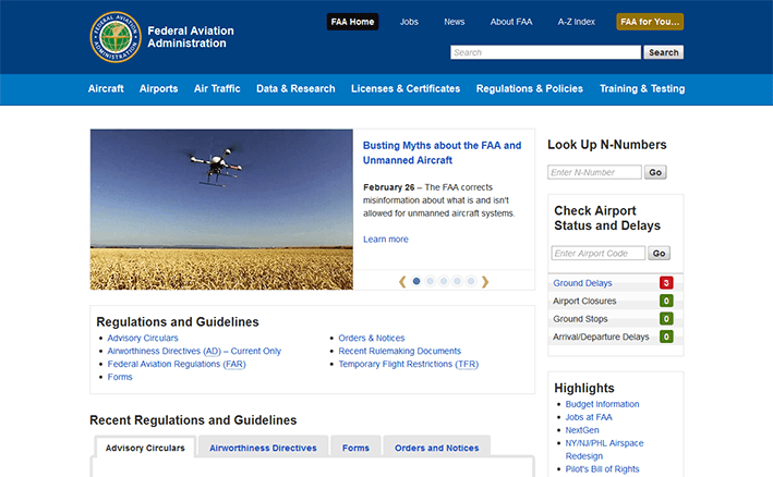
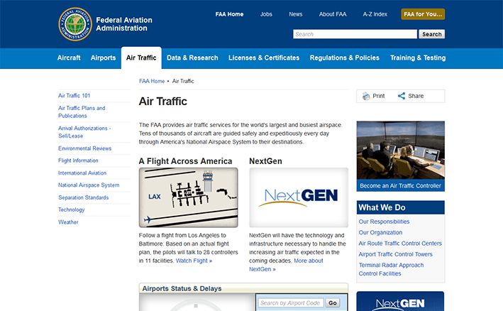
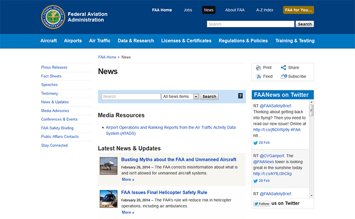
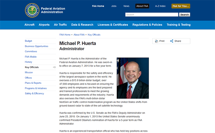
I unveiled a new site earlier this week for the Federal Aviation Administration. That is, it feels like an entirely new site because the changes are so sweeping and comprehensive. I’ve been referring to the project as a FAAcelift (get it?), but the scope of the project is much more than just a fresh coat of CSS.
A huge thanks to my coworkers and the FAA Office of Communications for their support and encouragement, and for entrusting me with this opportunity. Improving FAA’s public-facing website was pure bliss, and I’m fortunate that I was given the time — and autonomy — to commit the following changes to the template. When I wake up in the morning, I am always excited about getting to work. In a way, I feel privileged. The constant feeling of fulfillment never goes away.
Notable changes/improvements
Design/layout
- Responsive layout is informed by design breakpoints — not necessarily by device breakpoints. In other words, the responsive layout aspires to be device-agnostic.
- The appearance of pre-content page messages has been standardized. A “debugging” page message appears when the development tier is in debug mode. The News CMS mini-toolbar is styled in the same manner. Pre-content page messages are dismissible.
- FAA and DOT seals are approximately 25% larger than before. The words on the seals are closer to being legible.
- Text is, on average, 15% larger than before and is closer to browser default font sizes.
- The page tools box appears to reside in the right sidebar (to the right of the page title), but it remains visible even if the right sidebar is hidden.
- Text in ordered and unordered list items start at the same horizontal place on a given line. Intra-page anchor links (e.g.
class="anchorDown") are similarly aligned. - Vertical navigation supports additional levels of indentation. Example of prolific nesting
- Blank space between paragraphs and lists has increased to be equal to the default line height of its corresponding text. This affords consistent vertical flows of text.
- Message boxes look 43% less ugly. Also, they’re dismissible. Message box icons are from a single set: Chalkwork. Icon size has increased proportionally to the text size increase.
- Footer: Readers and Viewers icons better match current software branding used by Adobe and Microsoft. Icon size has increased proportionally to the text size increase.
- ForeSee modal dialog styles are closer to template styles. ForeSee’s FAA seal image, in particular, is more accurate.
- CSS filter effects progressive enhancement: desaturation of the page content when it loses “visual focus” to certain page elements with higher z-indexes:
- Colorbox modal dialog
- ForeSee modal dialog
- jQuery UI modal dialog
- A larger percentage of CSS rules use relative (em) unit values instead of absolute (px) unit values. With relative unit values, page element properties such as margin, padding, and width will scale relative to the user’s default font size (set in the browser) or font scale factor (set in the operating system).
- Font sizes (as calculated by the browser in pixels) are whole numbers when possible in an attempt to overcome differences (subtle and not-so-subtle) in font rendering and rounding among various browsers. See:
JavaScript
- A class of “noJS” or “js” is applied to the
<html>tag. The correct class is determined (via JavaScript) before any CSS is loaded, avoiding potential rendering engine repaints/reflows, and thus, an appearance of latency. - Upgraded to the latest stable releases of jQuery, jQuery Migrate, and jQuery UI.
- Upgraded template-level plugins Colorbox, bxSlider, and a forked version of beautyTips which I then had to fork again.
- When feasible, the site loads non-minified versions of JavaScript libraries and plugins on the development tier and minified versions of the same on the production tier. This makes it easier to debug JavaScript errors/warnings on the development tier.
Markup
- DTD changed to HTML5.
- Template markup is valid according to the HTML5 DTD.
- Removed
<meta>“keywords” from template output.
Browser support
- IE6 support has been dropped, as its marketshare has fallen below one-tenth of 1%. No testing occurs in this browser. For what it’s worth, IE6 loads the lone CSS “fixes” file, intended mostly for IE8.
- IE7 support has been dropped, as its marketshare has fallen below 2/3 of 1%. Cursory testing may still occur in this browser, although there is no guarantee that the template structure will hold up reasonably well. For what it’s worth, IE7 loads the lone CSS “fixes” file, intended mostly for IE8.
- JS-/canvas-based rounded corners has been dropped. It was previously implemented in IE7 and IE8.
User experience/accessibility
See section below for how I aspire to meet Web Content Accessibility Guidelines: WCAG 2.0
- “Skip to page content” link becomes visible on keyboard-activated focus.
- Keyboard-accessible (focusable) dropdown menus (horizontal navigation and “FAA for You”)
- Contrast between backgrounds and text complies with WCAG 2.0, Level AAA. (see section, below)
- Page Last Modified date above the footer is in the long-date format to resolve ambiguities surrounding the two-digit representations of the day, month and year, and the ordering of said numerals. If a short-date format is recommended for aesthetics, it should conform to ISO 8601.
- Page Last Modified time has been converted from the 24-hour clock (military time) to the 12-hour clock (AM/PM) for the sake of plain language and understandability. Additionally, the time zone indicator reports standard or daylight saving time as appropriate.
- All heading levels (
<h2>,<h3>, etc.) are properly differentiated by font size, line height, and margins. They are closer to browser defaults. - WAI-ARIA Landmark attributes adorn key sections.
- jQuery UI Tabs follow WAI-ARIA best practices.
- On hashchange events (such as “Skip to page content” or other intra-page anchor links), browser focus state now reliably mirrors visual focus across all browsers.
- Breadcrumb delimiter is no longer a right-pointing double-angle quotation mark, but a solid arrow. The arrow glyph is wrapped with aria-hidden=”true” to prevent screen readers from reading this design element.
- The legacy mode message (displayed in the pre-content area on the development tier) now reports all conditions that put the page into legacy mode. The messages are less cryptic and more developer-friendly.
- If the jQuery UI autocomplete widget in the site search field is left open and no item is selected, hovering over neighboring drop-down menus (“FAA For You…” or the horizontal nav) closes the autocomplete widget. This is done for the sake of minimizing z-index collisions.
Sticky horizontal navigation.
Web Content Accessibility Guidelines: WCAG 2.0
FAAcelift aspires to meet WCAG 2.0 (Level AAA), particularly in the visual presentation of text.
- 1.4.1: Use of color: The template is now fully compliant. In the previous version of the template, the visited link color was the same as the hovered link color. Hovering over visited links resulted in no visual change. This has been remedied in the latest template revision. Additionally, developers are encouraged to not use color as the only visual means of conveying information.
- 1.4.2: Audio control: Not applicable to the template. No known site sections or pages play audio on page load.
- 1.4.3: Contrast ratios (minimum): The template meets and exceeds this requirement. See full explanation in section 1.4.6 (below).
- 1.4.4: Resize text: Compliant in all page layout scenarios. See also 1.4.8.
- 1.4.5: Images of text: The template is compliant. See also section 1.4.9 (below).
- 1.4.6: Contrast ratios (enhanced): (Level AAA) “The visual presentation of text and images of text has a contrast ratio of at least 7:1” with limited exceptions.
Already compliant
- Page title
- Body copy
- Horizontal navigation
- Vertical navigation
- New design of footer (first row with blue background)
Made compliant
- Page subtitle: increased from 3.9:1 to 9.7:1
- Breadcrumb links: increased from 2.6:1 to 7.1:1 (not hovered) and 10.6:1 (hovered)
- Links (visited and unvisited): increased from 6.2:1 to 7.1:1
- Hovered links (visited and unvisited): increased from 3.2:1 to 10.6:1
- Input and textarea placeholder text: increased from 4.6:1 to 7.1. The color was deferring to the browser’s default placeholder color. In Firefox 25, for example, the default placeholder color passes WCAG AA but fails WCAG AAA.
Improved, but not compliant
- “FAA for You…” dropdown in the header: increased from 3.1:1 to 4.5:1. This complies with Level AA, but not Level AAA.
- 1.4.7: Low or No Background Audio: (Level AAA) Not applicable to the template.
- 1.4.8: Visual Presentation: (Level AAA)
- First requirement: Not compliant. We do not provide a mechanism for the user to change the background or foreground colors.
- Second requirement: Made compliant. In the default page layout (with both sidebars present), the average number of characters per line has been reduced from about 95 in template v. 3 to about 80 in template v. 4. The upper limit recommended by WCAG 2.0 is 80 characters.
- Third requirement: Partially compliant. Pro: we do not provide a CSS rule in the template to justify paragraph text. Con: we do not provide a mechanism in the template to un-justify text affected by custom CSS.
- Fourth requirement: Partially compliant. Text line height has increased slightly from 145% of text size to 150% to meet this requirement. Spacing between paragraphs has increased from 85% of line height to 100% of line height, but this spacing is not large enough to meet this requirement.
- Fifth requirement: Compliant in most scenarios when the template is in the default page layout (with both sidebars present). Newer browsers that support media queries are fully compliant, as the responsive layout ensures that the user will never have to scroll horizontally to read overflowing text.
Key advisory techniques for 1.4.8:
- Providing large fonts by default. “Large” is a relative term, but the base font size of the page (while still less than the browser default) is about 15% larger than before.
- Avoiding chunks of italic text. The default style for
<blockquote<displays text in the normal font style instead of in italics (or oblique). - Making links visually distinct. Breadcrumb links conform to the same link color scheme as the other links in the main content area.
- 1.4.9: Images of text (No exception): The template is fully compliant, but individual pages may not be fully compliant. Our “Visit FAA Mobile” ad in the footer violated this rule, but the image has been reworked as text styled with CSS. Right sidebar ads and homepage ads frequently violate this requirement. Merely providing alt text on images ensures Section 508 compliance but does not necessarily ensure compliance with this requirement.




I love the FAAcelift and I’m so proud of you, M@ ! Love, MOM